This Space Available
By Emily Carney
I recently wrote a short piece about the history of NASA’s “worm” logo, which started being utilized within the United States’ space agency during 1975, the year Apollo made its swansong. The “worm,” whether one loved it or hated it, is still associated with the nascent Space Shuttle program, and to an extent, NASA’s 1970s and 1980s decades.
Across the Atlantic during that same year, the newly-formed European Space Agency (ESA) also started using a freshly-designed logo as part of its corporate branding (or re-branding, as Europe’s space presence dated as far back as the late 1950s). While ESA has seen its logo undergo a few minor changes, like the NASA “worm” logo, it has retained its modernity throughout 45+ years. Here’s a capsule history of ESA’s logo, what it symbolizes, and the changes it has undergone.
Finding Europe’s Space: ESA’s Beginnings
By the early Seventies, the seeds for what would become the modern-day European Space Agency were being sown. In 1971 and 1972 respectively, two “package deals” were made; the first would address what would be done with the European Space Research Organisation (christened ESRO), and would create a template for future European space programs. The second package deal, discussed at the sixth European Space council meeting in Brussels, Belgium, would serve to shut down the European Launcher Development Organisation (ELDO), and made provisions for Germany to create an onboard lab for the Space Shuttle, which was then being developed by NASA. This lab, born from the ashes of a short-lived Shuttle “space tug” project, would come to be known as “Spacelab.”
While ELDO, which had attempted to develop a launcher called Europa with little success, was being dissolved, under the new agency provisions were also made for France to develop a launcher for Europe. The LIIIS (Lanceur à Trois Etages de Substitution) as it was initially called would later be called Ariane, the French name for the Greek goddess Ariadne, and would make its successful debut on December 24, 1979, launching from Europe’s Spaceport in Kourou, French Guiana.
A flurry of activity was expected for Europe’s space program with the development of the new launcher and the collaborative Spacelab; in addition, Europe would need to recruit its first astronauts as part of its deal to provide Spacelab hardware to the United States. According to ESA’s website, “Europe agreed to deliver free of charge the Engineering Model and the first Flight Unit, plus ground support equipment, in return for a shared first mission.” It was hoped that Spacelab would first fly nestled within a Shuttle’s payload bay by 1980 (however, as we all know, this timeline would shift to a more realistic 1983).
All of these developments meant Europe’s space agency needed a strong, modern identity – enter the ESA logo, which made one of its first appearances on the cover of ESA Bulletin #1 in June 1975.
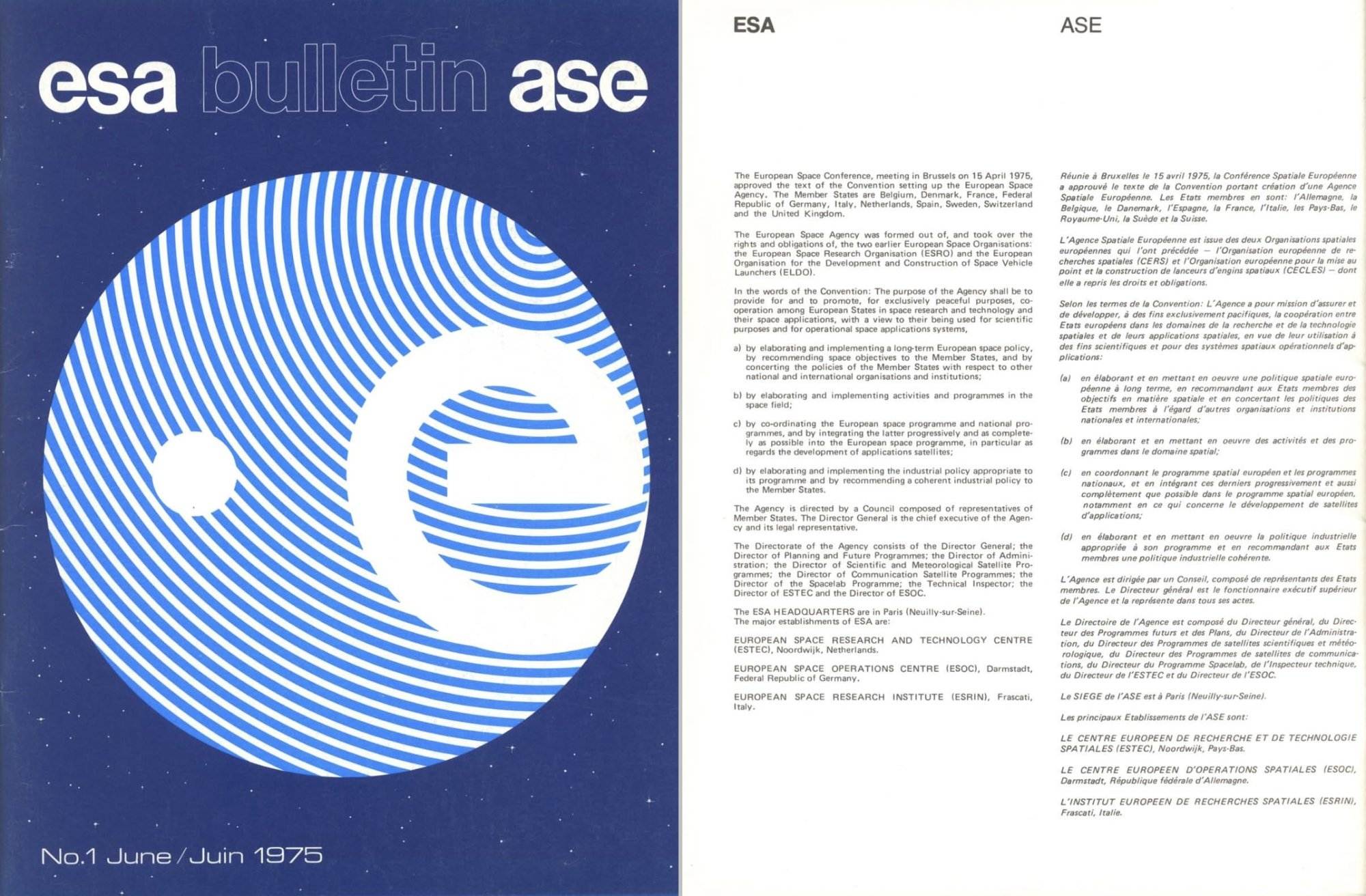
The Evolution of ESA’s Logo, 1975 to Present
According to ESA’s corporate editor (and space patch enthusiast) Carl Walker, “The original design came from a team of three people: Martin-Pierre Hubrecht (ESA Publications Office), Petty Brown (ESA Public Relations Service) and Jean-Marie Schourgnoz (graphic designer from the company ‘New Print’). The original idea behind the design was that the letter ‘e’ stands for Earth, Europe and ‘ESA,’ the circular shape represents our planet Earth, the lower case ‘e’ is placed where Europe would be on the surface of the globe, [and] the small dot on the left represents a satellite…the concentric lines would represent the parallels and give a 3D effect.”
The original logo’s concentric lines also possessed multiple symbolic meanings: it was meant to give the logo a fingerprint-like “human touch” as the agency branched out into human spaceflight, signified the agency’s uniqueness, and according to Walker, “It could also signify the basic genetic characteristic, hinting at part of ESA’s science mission to search for the origins of life on Earth or on other worlds.” Unlike NASA, ESA did not standardize the use of its logo in stationery immediately. Between 1975 and 1977, the “thumbprint” and an ESA typeface “mark” were used together, or separately. But after 1977, the “thumbprint” and the ESA typeface were always used side-by-side.
During the late part of the previous decade, ESA released new graphics standards that further refined their corporate branding, uses of their logo, and typography. These were released in ESA Bulletin 141, February 2010; the bulletin in part reads, “Throughout 2010, ESA will be progressively appearing in this new style. The ESA Bulletin and Web Portal were launched in this new livery in 2008 and 2009.” At present time, ESA prefers the use of a simplified logo (called a “Deep Space” logo, perhaps hearkening to ESA’s success with deep space missions such as Giotto and Rosetta), which can be printed in a dark blue four-process CMYK color (C100 M30 Y20 K75).
The ESA Astronauts’ Patches
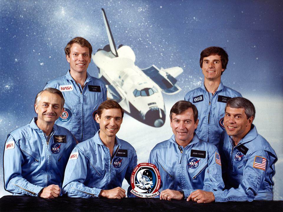
Walker also discussed the evolution of the ESA astronaut patch, which first debuted in spaceflight during late 1983’s STS-9/Spacelab-1 mission on German astronaut Ulf Merbold’s lapel. Much like ESA’s logo, it has also evolved:
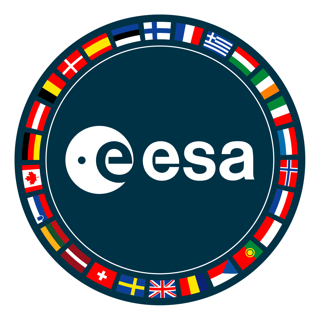
An interesting variation is the ESA astronaut patch. Many people think this is the actual logo, but this was developed later along with various other mission and project patches, each from separate establishments evolving different styles. It has changed over the years, depending on member states, what suits it would be worn on, and where the astronauts were flying from and who with. NASA had to develop specific rules for patches on suits at the time the non-US payload specialists were selected. Today’s ESA astronaut patch evolved from the rectangular shape to the circular form to accommodate more Member State flags, now Associate Members were included as well as Canada as a long-standing cooperating state.
It also bears mentioning that current European astronauts’ mission patches also follow ESA’s corporate branding guidelines, as set forth in the aforementioned ESA Bulletin 141. A complete list of European human spaceflight mission patches can be located at this link (note: some of these missions are non-ESA spaceflights, and therefore do not follow ESA’s corporate branding standards).
The Hubble Space Telescope, perhaps one of the most famous NASA/ESA collaborations, proudly wears both the NASA “worm” and the ESA logo approximately 340 miles above Earth. At present time, German ESA astronaut Matthias Maurer orbits above the Earth aboard the International Space Station, wearing ESA’s logos. Moreover, within days, the much-awaited James Webb Space Telescope (JWST) will launch from Europe’s Spaceport aboard a mighty Ariane 5 launch vehicle, which will also carry an ESA logo (the JWST is a NASA-ESA-Canadian Space Agency collaboration).
ESA has managed to keep its corporate branding timeless throughout the decades – well past the disco-soaked Seventies – thanks to minor tweaks and modifications. While the agency’s main logo is modern and stylized like the NASA “worm,” its combined elements make it unique. Strategic corporate branding worked to establish ESA not as a “European version of NASA,” but as a space agency with a strong sense of its own identity and heritage.

Many grateful thanks to ESA’s Carl Walker for his participation. All information regarding ESA’s current graphics standards can be located via this link. Note: some of this piece was extrapolated from “Space for Europe and for all humankind: a brief history of the ESA,” which I wrote for Ars Technica in 2015.
Featured Image Credit: “The Deep Space version of the logo is the preferred colour on a white, neutral or light coloured background.” Via ESA
*****
Emily Carney is a writer, space enthusiast, and creator of the This Space Available space blog, published since 2010. In January 2019, Emily’s This Space Available blog was incorporated into the National Space Society’s blog. The content of Emily’s blog can be accessed via the This Space Available blog category.
Note: The views expressed in This Space Available are those of the author and should not be considered as representing the positions or views of the National Space Society.
