 |
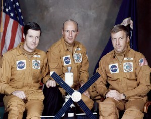
| Dr. Joseph Kerwin, Charles “Pete” Conrad, Jr., and Paul Weitz, each sporting the mission patch designed by artist Frank Kelly Freas. 1973 NASA photo. |
A grand, spider-like space station, stark and monolithic, silhouetted against the seas of a blue and green Earth, all against the backdrop of a fiery, violent Sun flaring away: this was one of the first images associated with Skylab iconography in the early 1970s, and was courtesy of someone who may have seemed to be an unlikely space mission patch designer. The artist was called “the dean of science fiction artists” and was perhaps more well-known for his magazine and book covers, which adorned science-fiction pulp magazines with pithy names such as Weird Tales and Astounding Science Fiction. How did someone commonly associated with buxom space divas become the originator of one of the (in my estimation) best space mission patches?
Who Was Frank Kelly Freas?
New York native Frank Kelly Freas was born on August 27, 1922. While in general I’m not a fan of Wikipedia, the site does have a decent Freas biography, but of course I’d better recommend his own website. His career in sci-fi art began to take off in late 1950, when his first cover for Weird Tales debuted. Over the decades, Freas designed covers and other interior artwork for science fiction pulp magazines and novels, and continued with Astounding Science Fiction as it transitioned into Analog Science Fiction & Fact circa 1960. His bibliography as an artist is astounding itself in its sheer volume; a casual glance at his résuméoutlines hundreds of covers and commissions, including work in Mad magazine. The diversity of his artwork, too, is amazing; Freas painted everything from Barbarella-esque space pin-up girls, spacecraft, and vast starscapes, and far beyond.
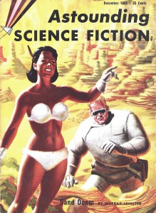 |
| December 1955 cover of Astounding Science Fiction. Artwork by Frank Kelly Freas |
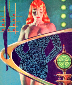 |
| Retrieved from The Vault of Retro Sci-Fi on Tumblr |
Freas’ influence on the genre and ubiquity, of course, did not go unnoticed, and he received a great manyHugo Awards (liken theseto the Oscars of science fiction, bes
towed by the World Science Fiction Society). He was inducted posthumously (Freas died in 2005) into the Science Fiction Hall of Fame in 2006, forever recognized for his voluminous 50-year career.
The story of Freas’ Skylab odyssey was published in the June 1973 issue of Analog, while Pete Conrad, Joseph Kerwin, and Paul Weitz were hard at work in orbit, repairing and utilizing America’s first space station, Skylab. Freas wrote,
It was [science fiction writer] Ben Bova on the phone: “How would you like to do a shoulder patch for the first Skylab crew?”
“Love it.”“Well, I gave them your address and phone number…if you don’t get word from them in a couple of days, call Commander Kerwin at this number…”Forty-seven hours and fifty-nine minutes later, I was on the phone to Houston: “About that shoulder patch…”
While I obviously won’t just cut and paste the entire story here (you’ll have to click on the link, and read the entire thing for yourself), Kerwin did discuss the mission’s objectives with Freas, in part to inspire the design; Kerwin underscored that “[t]he kinds of ideas we’ve been tossing around have emphasized that it’s a peaceful mission; that in addition to doing pure science a la Apollo, we’re doing work that will directly benefit Mother Earth and its citizens; and that, in a very real sense, we are doing more than just exploring near-Earth space…we’re homesteading it, preparing to live and work up there.” Kerwin also emphasized the three main areas of study the crews would partake in, including solar physics studies, medical experiments, and Earth observations.
While Freas came up with several drafts, he wanted to optimize the patch’s design so it was made to be embroidered. He knew instinctively that certain designs would not work in a small area. In addition, he wrote, “It very quickly became clear that there was only one way to look at Skylab which would instantly establish its identity. No 3-D, no perspective, no cute angle shots…it must be a flat-on dead square silhouette. We would let the Skylab cluster become its own symbol.” Notes about color choices and deciding on the patch shape are also included in the article’s text.
Work continued, and Freas let it be known that patch design was not as easy as some might think. He added, “Being a naturally lousy letterer, I did the lettering roughly 483 times [my emphasis] before I got it somewhere near right, and then discovered that I had reversed the ei in Weitz. Doesn’t sound like much of a problem until you realize that it changes the spacing of all the letters in the name, and shifts all three names a few degrees left, which meant also adjusting the background to give adequate contrast.” Luckily, the final cutwas met with “enthusiastic approval” by the three crew members, and the rest, as they say, is history – the now iconic design was prominently featured in the crew’s official photo.
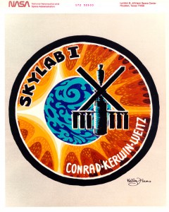 |
| The finished article. NASA image, retrieved from Gene Dorr’s website |
Why do I consider this the best space mission patch? (Disclaimer: if you think there was another “best” space patch, that is fine, no arguments in the comments please.) First, Freas kept the design relatively simple. The portentous Latin phrases in previous drafts were jettisoned, leaving just the mission’s name,
the crew’s last names, and the glorious space station silhouetted against the Earth and Sun – two of the mission’s major scientific targets. In addition, the patch is accurate. Skylab’s solar panels are oriented correctly toward the Sun, just as they would be in real life.
While Skylab 2’s mission ended in June 1973 after 28 days in orbit, the mission’spatch design would leave resonances throughout the next few decades. Artist Tim Gagnon was inspired by the December 1972 Apollo 17 launch, which he viewed with his father as invited guests of NASA; in addition, his imagination was fired by the Analog magazine article detailing Freas’ Skylab designs. Shortly thereafter, Gagnon began designing his own mission patches, and became a high profile space artist in his own right; his 2005 Expedition 11 patch was only the first in a long line of flown designs.
Freas, F.K. (1973.) “Skylab Patchwork.” Retrieved from Gene Dorr’s website (http://genedorr.com/patches/Patchwork.html)
Emily Carney is a writer, space enthusiast, and creator of the This Space Available space blog, published since 2010. In January 2019, Emily’s This Space Available blog was incorporated into the National Space Society’s blog. The content of Emily’s blog can be accessed via the This Space Available blog category.
Note: The views expressed in This Space Available are those of the author and should not be considered as representing the positions or views of the National Space Society.
